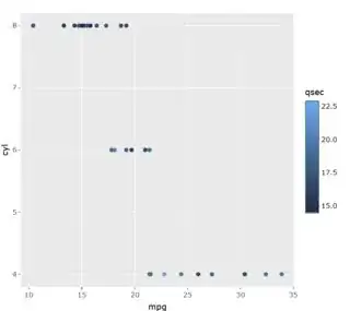
Plotly won't make a discrete legend for you, but you can still make it happen.
First, I assigned both the ggplot and ggplotly to objects.
plt <- ggplotly(
  ggplot(data=mtcars,
         aes(x=mpg, y=cyl, color=qsec)) +
    geom_point()
)

g <- ggplot(data=mtcars,
            aes(x=mpg, y=cyl, color=qsec)) +
  geom_point()
Next, use the data behind the ggplot object, combined with mtcars, to get a color by qsec data frame, so that you know what colors go with what values.
colByVal <- cbind(ggplot_build(g)$data[[1]], mtcars) %>%
  as.data.frame() %>%
  select(colour, qsec) %>% arrange(qsec) %>%
  group_by(colour) %>%
  summarise(qsec = median(qsec)) %>% as.data.frame()
I figured that four or five values would be ideal. I just used summary to pick them. However, that's not necessary. Obviously, you can choose however many values you would like. These are the values I'll show in the legend.
parts <- summary(colByVal$qsec)
# drop the mean or median (the same color probably)
parts <- parts[-4]
Next, use DescTools::Closest to find the qsec values closest to the summary values.
vals <- lapply(parts, function(k) {
  DescTools::Closest(colByVal$qsec, k)[1]
}) %>% unlist(use.names = F)
Use these qsec values and the data frame with value by color to get the colors associated with these values.
cols <- colByVal %>%
  filter(qsec %in% vals) %>% select(colour) %>%
  unlist(use.names = F)
Using the colors and values (legend labels), use shapes and annotations (circles and text) to rebuild the legend. There is only one other element that needs to change between each legend item, the y position of the legend entry.
ys <- seq(from = .7, by = .07, length.out = length(cols))
There are two functions: shapes and annotations. Using lapply, walk through the values, colors, and y values through these functions to create the shapes and annotations.
# create shapes
shp <- function(y, cr) { # y0, and fillcolor
  list(type = "circle",
       xref = "paper", x0 = 1.1, x1 = 1.125,
       yref = "paper", y0 = y, y1 = y + .025,
       fillcolor = cr, yanchor = "center",
       line = list(color = cr))
}
# create labels
ano <- function(ya, lab) { # y and label
  list(x = 1.13, y = ya + .035, text = lab,
       xref = "paper", yref = "paper",
       xanchor = "left", yanchor = 'top',
       showarrow = F)
}
# the shapes list
shps <- lapply(1:length(cols),
               function(j) {
                 shp(ys[j], cols[j])
               })
# the labels list
labs <- lapply(1:length(cols),
               function(i) {
                 ano(ys[i], as.character(vals[i]))
               })
When you use ggplotly, for some reason it ends an empty shape to the ggplotly object. This interferes with the ability to call for shapes in layout (which is the proper method). You have to force the issue with shapes. Additionally, the legend bar needs to go away. Once you drop the legend bar, Plotly will adjust the plot margins. The legend created with shapes and annotations will be hidden if you don't add the margins back.
# ggplot > ggplotly adds an empty shape; this conflicts with calling it in
#   layout(); we'll replace 'shapes' first
plt$x$layout$shapes <- shps
plt %>% hide_colorbar() %>%
  layout(annotations = labs, showlegend = F,
         margin = list(t = 30, r = 100, l = 50, b = 30, pad = 3))

All of that code in one chunk:
library(tidyverse)
library(plotly)
# original plot
plt <- ggplotly(
  ggplot(data=mtcars,
         aes(x=mpg, y=cyl, color=qsec)) +
    geom_point()
)
g <- ggplot(data=mtcars,
            aes(x=mpg, y=cyl, color=qsec)) +
  geom_point()
# color by qsec values frame
colByVal <- cbind(ggplot_build(g)$data[[1]], mtcars) %>%
  as.data.frame() %>%
  select(colour, qsec) %>% arrange(qsec) %>%
  group_by(colour) %>%
  summarise(qsec = median(qsec)) %>% as.data.frame()

parts <- summary(colByVal$qsec)
# drop the mean or median (the same color probably)
parts <- parts[-4]

vals <- lapply(parts, function(k) {
  DescTools::Closest(colByVal$qsec, k)[1]
}) %>% unlist(use.names = F)

cols <- colByVal %>%
  filter(qsec %in% vals) %>% select(colour) %>%
  unlist(use.names = F)

ys <- seq(from = .7, by = .07, length.out = length(cols))

# create shapes
shp <- function(y, cr) { # y0, and fillcolor
  list(type = "circle",
       xref = "paper", x0 = 1.1, x1 = 1.125,
       yref = "paper", y0 = y, y1 = y + .025,
       fillcolor = cr, yanchor = "center",
       line = list(color = cr))
}
# create labels
ano <- function(ya, lab) { # y and label
  list(x = 1.13, y = ya + .035, text = lab,
       xref = "paper", yref = "paper",
       xanchor = "left", yanchor = 'top',
       showarrow = F)
}
# the shapes list
shps <- lapply(1:length(cols),
               function(j) {
                 shp(ys[j], cols[j])
               })
# the labels list
labs <- lapply(1:length(cols),
               function(i) {
                 ano(ys[i], as.character(vals[i]))
               })
# ggplot > ggplotly adds an empty shape; this conflicts with calling it in
#   layout(); we'll replace 'shapes' first
plt$x$layout$shapes <- shps
plt %>% hide_colorbar() %>%
  layout(annotations = labs, showlegend = F,
         margin = list(t = 30, r = 100, l = 50, b = 30, pad = 3))


