I'm trying to create a heat map for an OD matrix, but I wanted to scale the rows and columns by certain weights. Since these weights are constant across each category I would expect the plot would keep the rows and columns structure.
# Tidy OD matrix
df <- data.frame (origin  = c(rep("A", 3), rep("B", 3),rep("C", 3)),
                  destination = rep(c("A","B","C"),3),
                  value = c(0, 1, 10, 5, 0, 11, 15, 6, 0))

# Weights
wdf <- data.frame(region = c("A","B","C"),
                  w = c(1,2,3))

# Add weights to the data.
plot_df <- df %>%
  merge(wdf %>% rename(w_origin = w), by.x = 'origin', by.y = 'region') %>%
  merge(wdf %>% rename(w_destination = w), by.x = 'destination', by.y = 'region')
Here's how the data looks like:
> plot_df
  destination origin value w_origin w_destination
1           A      A     0        1             1
2           A      C    15        3             1
3           A      B     5        2             1
4           B      A     1        1             2
5           B      B     0        2             2
6           B      C     6        3             2
7           C      B    11        2             3
8           C      A    10        1             3
9           C      C     0        3             3
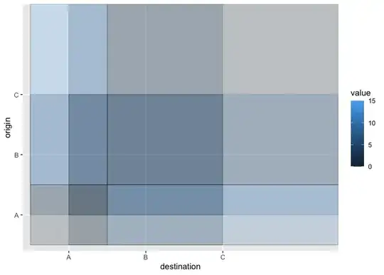
However, when passing the weights as width and height in the aes() I get this:
ggplot(plot_df,
       aes(x = destination,
           y = origin)) +
  geom_tile(
    aes(
      width = w_destination,
      height = w_origin,
      fill = value),
    color = 'black')

It seems to be working for the size of the columns (width), but not quite because the proportions are not the right. And the rows are all over the place and not aligned.
I'm only using geom_tile because I could pass height and width as aesthetics, but I accept other suggestions.
