Is it possible to create a box like the one below with notches in the center of the top and bottom line? (including the border inset?)
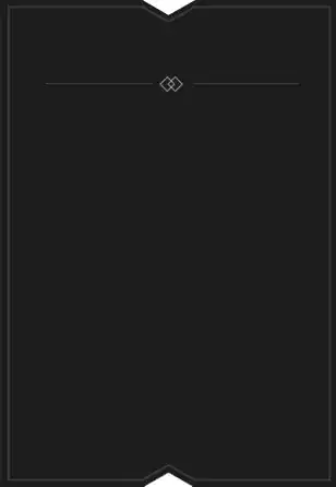
Is it possible to create a box like the one below with notches in the center of the top and bottom line? (including the border inset?)
Here's a Working Fiddle Tested On: Ie10, FF, Chrome, Safari
just put your content inside the .Content div. (should support any size of content)
HTML:
<div class="SpecialBox">
    <div class="TopTriangle">
        <div class="Gray Border">
            <div class="Black Border">
                <div class="White Border"></div>
            </div>
        </div>
    </div>

    <div class="Content">
        Some Content
        <br />
        And another line of Content
    </div>

    <div class="BottomTriangle">
        <div class="Gray Border">
            <div class="Black Border">
                <div class="White Border"></div>
            </div>
        </div>
    </div>
</div>
CSS:
*
{
    margin: 0;
    padding: 0;
}

.SpecialBox
{
    background-color: black;
    -webkit-box-shadow: inset 0 0 0 5px black, inset 0 0 0 6px gray;
    box-shadow: inset 0 0 0 5px black, inset 0 0 0 6px gray;
    display: inline-block;
    color: white;
    overflow: hidden;
    position: relative;
}
.Content
{
    padding: 20px;
}

.Border
{
    width: 0;
    border-left: 35px solid transparent;
    border-right: 35px solid transparent;
    position: absolute;
}

.Gray
{
    position: relative;
    margin: 0 auto;
}
.TopTriangle .Gray
{
    border-top: 25px solid gray;
}
.BottomTriangle .Gray
{
    border-bottom: 25px solid gray;
    top: -1px;
}

.Black
{
    left: -35px;
}
.TopTriangle .Black
{
    border-top: 25px solid black;
    top: -27px;
}
.BottomTriangle .Black
{
    border-bottom: 25px solid black;
    top: 1px;
}

.Black:before
{
    content: '';
    position: absolute;
    left: -35px;
    width: 70px;
    height: 6px;
    background-color: black;
}
.TopTriangle .Black:before
{
    top: -24px;
}
.BottomTriangle .Black:before
{
    top: 19px;
    z-index: 1;
}

.White
{
    left: -35px;
}
.TopTriangle .White
{
    border-top: 25px solid white;
    top: -30px;
}
.BottomTriangle .White
{
    border-bottom: 25px solid white;
    top: 6px;
    z-index: 2;
}
Notice: It can probably done with few elements in the DOM (using more pseudo elements)
Trying to do it with minimal markup , and the notches and the inset transparent:
CSS
.test {
    position: absolute;
    width: 200px;
    height: 400px;
    top: 40px;
    left: 40px;
    background-image: linear-gradient(-135deg, transparent 30px, black 30px),
    linear-gradient(135deg, transparent 30px, black 30px),
    linear-gradient(-45deg, transparent 30px, black 30px),
    linear-gradient(45deg, transparent 30px, black 30px),
    radial-gradient(200px 5px ellipse at 50% 50%, transparent 70px,
               black 73px);
    background-size: 50% 20%, 50% 20%, 50% 72%, 50% 72%, 100% 10%;
    background-position: left top, right top, left bottom, right bottom, left 20%;
    background-repeat: no-repeat;
}
And, as promised, a simple HTML
<div class="test"></div>
NOTE: the example uses the latest gradient syntax. Can be made to work in any browser that supports multiple backgrounds, adapting the gradient syntax
This solution is using an image (a very wide one) to cover all the possible width that a box will ever take. and using border-image. (Currently not supported in IE)
HTML:
<div class="SpecialBorder">
    <div class="Content">
        Some Content
    </div>
</div>
CSS:
.SpecialBorder
{
    border: 20px solid black; /* fallback for IE*/
    -moz-border-image: url(https://i.stack.imgur.com/ZB9vk.png) 20 20 repeat;
    -o-border-image: url(https://i.stack.imgur.com/ZB9vk.png) 20 20 repeat;
    -webkit-border-image: url(https://i.stack.imgur.com/ZB9vk.png) 20 20 repeat;
    border-image: url(https://i.stack.imgur.com/ZB9vk.png) 20 20 repeat;

}
.Content
{
    background-color: #1d1d1d; /* same BG as the image*/
}