Your ggplot code isn't showing the same thing as sjPlot. All your ggplot code does is show the mean value for Erreur in the two groups of Sex. The plot_model function with type = "pred" shows you the marginal effect of Sex on the predictions, that is, the effect Sex has on probability if the other variables are held level.
We can demonstrate this with a fictitious data set:
set.seed(1)

df <- data.frame(Sex = rep(rep(c("F", "M"), 2), times = c(900, 900, 100, 100)),
                 ProbErreur = rep(0:1, times = c(1800, 200)),
                 Erreur = rbinom(2000, 1,
                                 rep(c(0.03, 0.02, 0.9, 0.85),
                                     times = c(900, 900, 100, 100))))

model1 <- glm(Erreur ~ Sex + ProbErreur, df, family = binomial)
This gives us a model where the probability of Erreur is very low when ProbErreur is 0, but high if ProbErreur is 1. There is a small effect of Sex too, just as in your own model:
summary(model1)
#>
#> Call:
#> glm(formula = Erreur ~ Sex + ProbErreur, family = binomial, data = df)
#>
#> Deviance Residuals:
#>     Min       1Q   Median       3Q      Max
#> -2.1553  -0.2364  -0.1846  -0.1846   2.8570
#>
#> Coefficients:
#>             Estimate Std. Error z value Pr(>|z|)
#> (Intercept)  -3.5636     0.1890 -18.857   <2e-16 ***
#> SexM         -0.5005     0.2629  -1.904   0.0569 .
#> ProbErreur    5.7832     0.2733  21.162   <2e-16 ***
#> ---
#> Signif. codes:  0 '***' 0.001 '**' 0.01 '*' 0.05 '.' 0.1 ' ' 1
#>
#> (Dispersion parameter for binomial family taken to be 1)
#>
#>     Null deviance: 1365.03  on 1999  degrees of freedom
#> Residual deviance:  530.62  on 1997  degrees of freedom
#> AIC: 536.62
#>
#> Number of Fisher Scoring iterations: 6
If we use sjPlot, we get something similar to your plot:
library(sjPlot)
library(ggplot2)

plot_model(model1, type = "pred", show.p = TRUE, terms = "Sex",
           ci.lvl = 0.95, show.data = FALSE,
           axis.title = c("", "Probability of Error"), title = "") +
  scale_x_discrete(limits = c("Female", "Male"))

This shows the estimated probabilities of Sex when ProbErreur is 0.
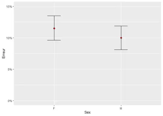
The ggplot, on the other hand, shows the overall probability in the M and F groups:
ggplot(df, aes(Sex, Erreur)) +
  stat_summary(fun.data = mean_cl_boot, geom = "errorbar", width = 0.2) +
  stat_summary(fun = mean, geom = "point", shape = 21, fill = "red", size = 2) +
  scale_y_continuous(labels = scales::percent_format(), limits = c(0, 1)) +
  coord_cartesian(ylim = c(0, 0.15))
If you want to replicate sjPlot in vanilla ggplot, you would need to get model predictions and confidence intervals where ProbErreur is 0:
pred_df <- data.frame(Sex = c("F", "M"), ProbErreur = 0)
preds <- predict(model1, newdata = pred_df, se.fit = TRUE)
pred_df$fit <- plogis(preds$fit)
pred_df$upper <- plogis(preds$fit + preds$se.fit * 1.96)
pred_df$lower <- plogis(preds$fit - preds$se.fit * 1.96)

ggplot(pred_df, aes(Sex, fit)) +
  geom_errorbar(aes(ymin = lower, ymax = upper), width = 0.2) +
  geom_point(shape = 21, fill = "red", size = 2) +
  scale_y_continuous(labels = scales::percent_format(), limits = c(0, 1)) +
  coord_cartesian(ylim = c(0, 0.05))

You can specify the value of the covariates in your predictions inside of sjPlot, and it is also possible to modify the geom layers in sjPlot without resorting to calculating your own marginal predictions and plotting directly in ggplot.
Created on 2023-08-01 with reprex v2.0.2


